Chapeau
In times in which ostentation has gone out of fashion and luxury has become a hedonistic experience, the brands of reference from the fashion world strive to point out, not just with extraordinary advertising campaigns, but with a coherent and harmonious strategy ranging from the design of its collections to the architecture of its stores. Additionally, taking into account the top fashion designers leading their teams, along with the vanguard architecture that materialises the values and concepts identified in their retail space.
Brands such as Prada, Gucci, Dior, Neil Barret or Helmut Lang flirt with art, design and contemporary architecture making it so that the value of the brand is more linked to the design than to the material of which the product is made of itself.
The fashion world is in need of spaces with identity that boost the value of their collections for which the product is displayed in all its attractiveness. In this way, the product, the space and even the client treatment will convey an universe designed for the purchase to become the best of experiences.
Chapeau is a multi-brand store born out of this context. Located in the heart of Valencia, offering a collection of the most prominent proposals in the scenery of international fashion. The selection that Chapeau makes, a collection of the best pieces from the most influential brands, is its seal of identity.
At the time of materialising the space, this was a great challenge since it coexists in a variety of proposals that are renewed according to the different seasons. The space should be quite flexible yet with enough character to convey the quality of their content.
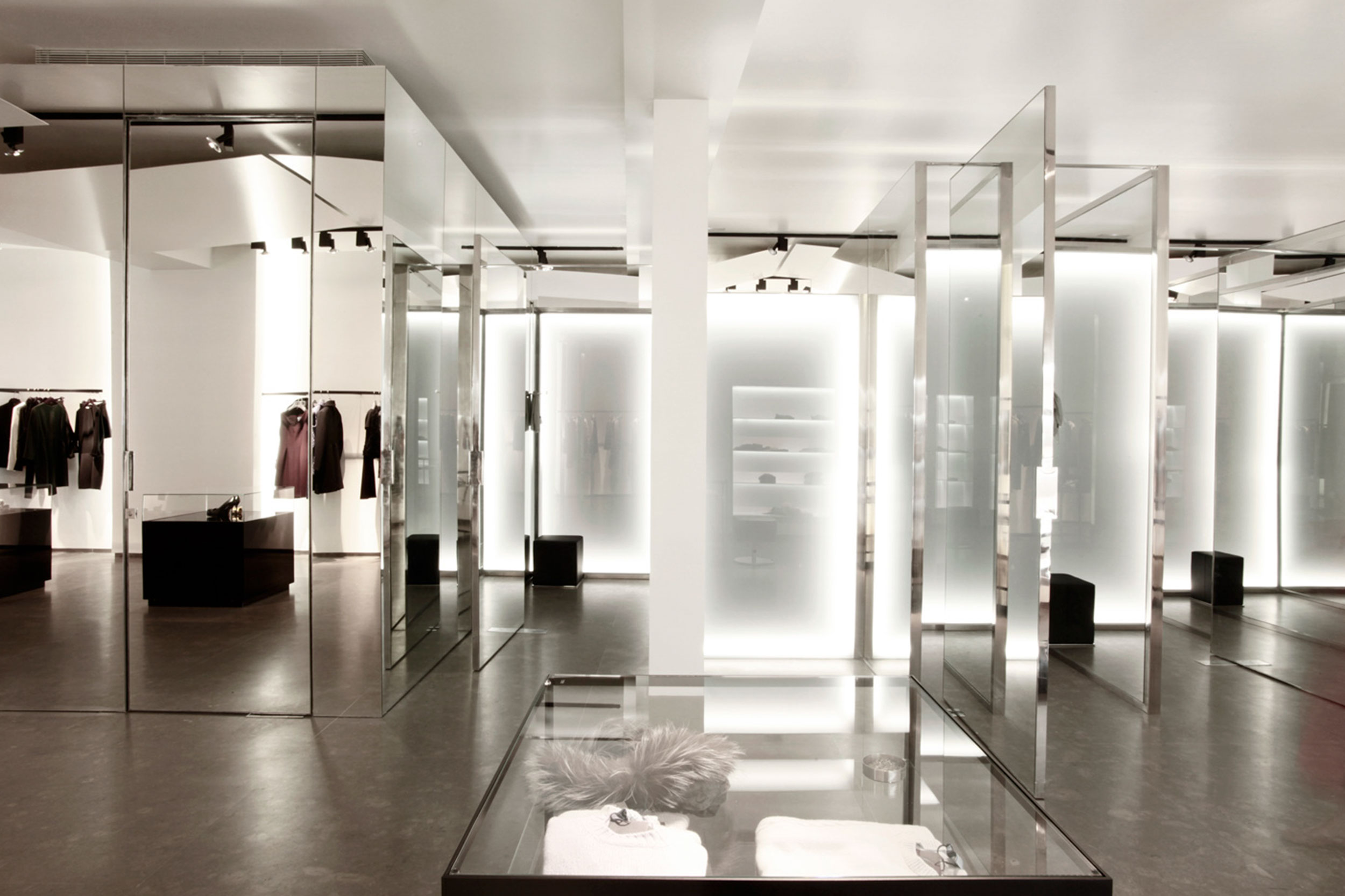
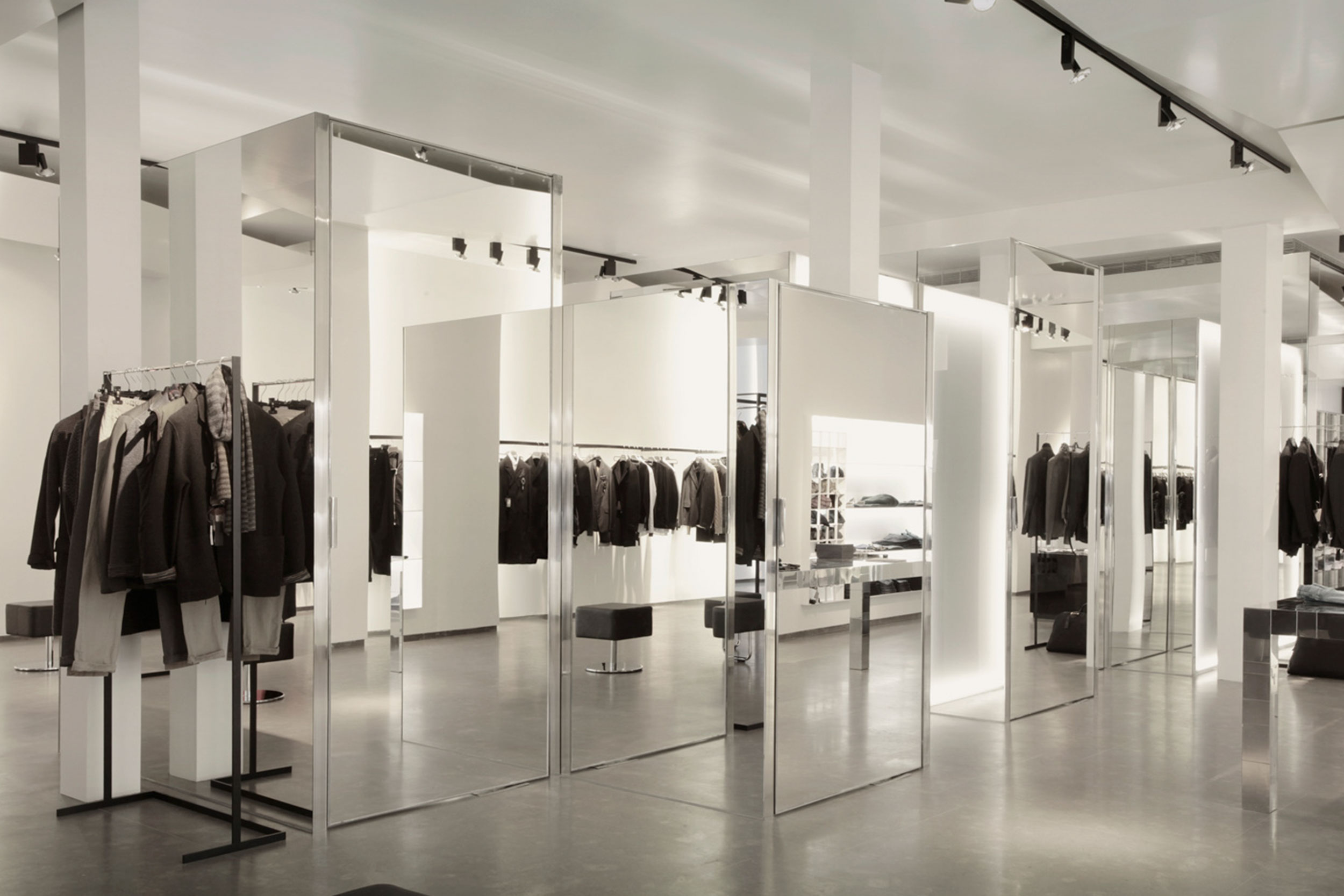
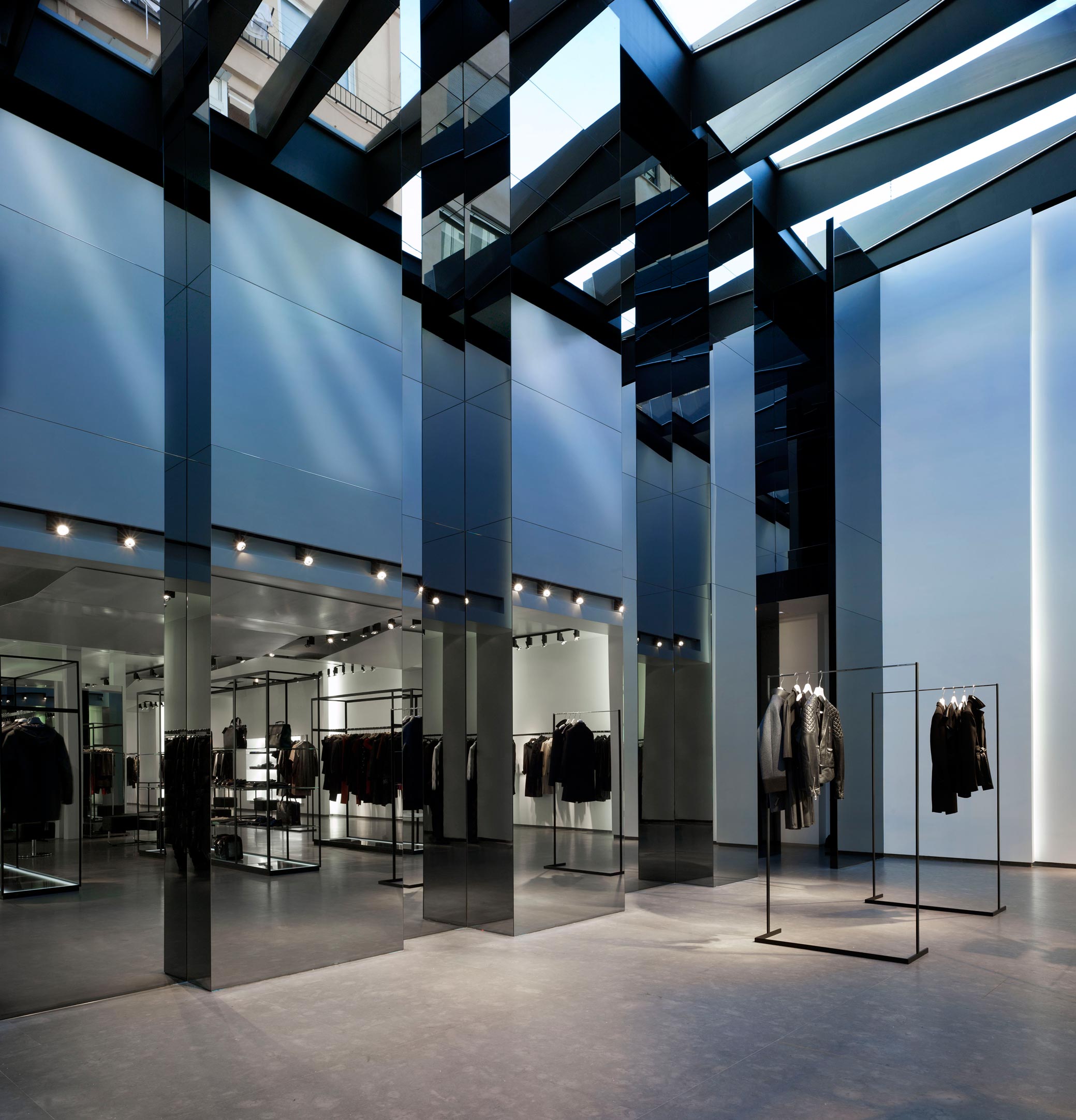
The experience that the customer experiences when entering the store is a journey through a sequence of scenes. It begins with a large canopy of black steel, illuminated by a few tears that frame the glass façade. To the sides, there are two independent entrances, for men and women that function as scenarios in which are exhibited the exposed collections. There is no window display defined for usage, but an extension of the same area that takes over the space of the store and offers from its beginning a whole sequence of exhibitions. The two independent paths that open the store are finally fused in an environment set in which the store acquired a great amplitude on having transformed into a space of double height, crowned by the opening of a skylight showing the flow of natural light.
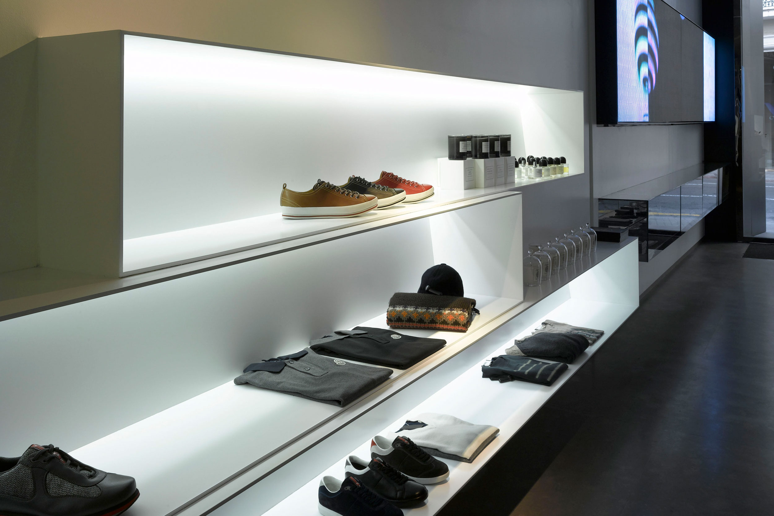
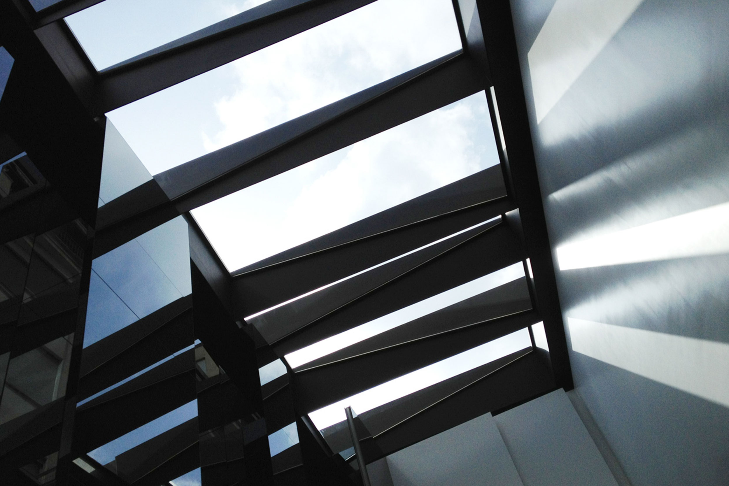
Compositionally, the project is defined by a game of lights and shadows; reflections and pure geometric patterns that resolve the project from the architecture up to the detail of the furniture. The range of colors reduced to white, grey and black contrasts with the radicalism of its prismatic volumes of the mirror that blur the space.
Words: Ramón Esteve
Discover more at